Q1 2024 - Q1 2025
Console Connect

Background
Nimbus Design System was intended to be a single source of truth for design and development. In practice, the lack of governance caused it to fragment over time, making it inconsistent, bloated, and increasingly difficult to trust.
Core problem
Collaboration between teams broke down, accessibility standards slipped, and even experienced designers and developers found the system frustrating to use. Nimbus had effectively become a kitchen sink; filled with redundant components, conflicting patterns, and unclear ownership.
The Approach for Nimbus UI
My task was to lead the complete overhaul of Nimbus; defining its vision, rebuilding components and tokens, embedding accessibility by default, and streamlining governance for scale.
Research & Discovery
To understand where Nimbus was failing and why, I started with research focused on real-world usage.
Conducted cross-disciplinary interviews
Interviewed nine designers and developers to understand pain points, friction, and trust issues in the existing design system, with a focus on real day-to-day usage rather than idealised workflows.Synthesised insights using Dovetail
Analysed and clustered interview data in Dovetail, mapping patterns and recurring issues into clear, actionable themes rather than isolated feedback.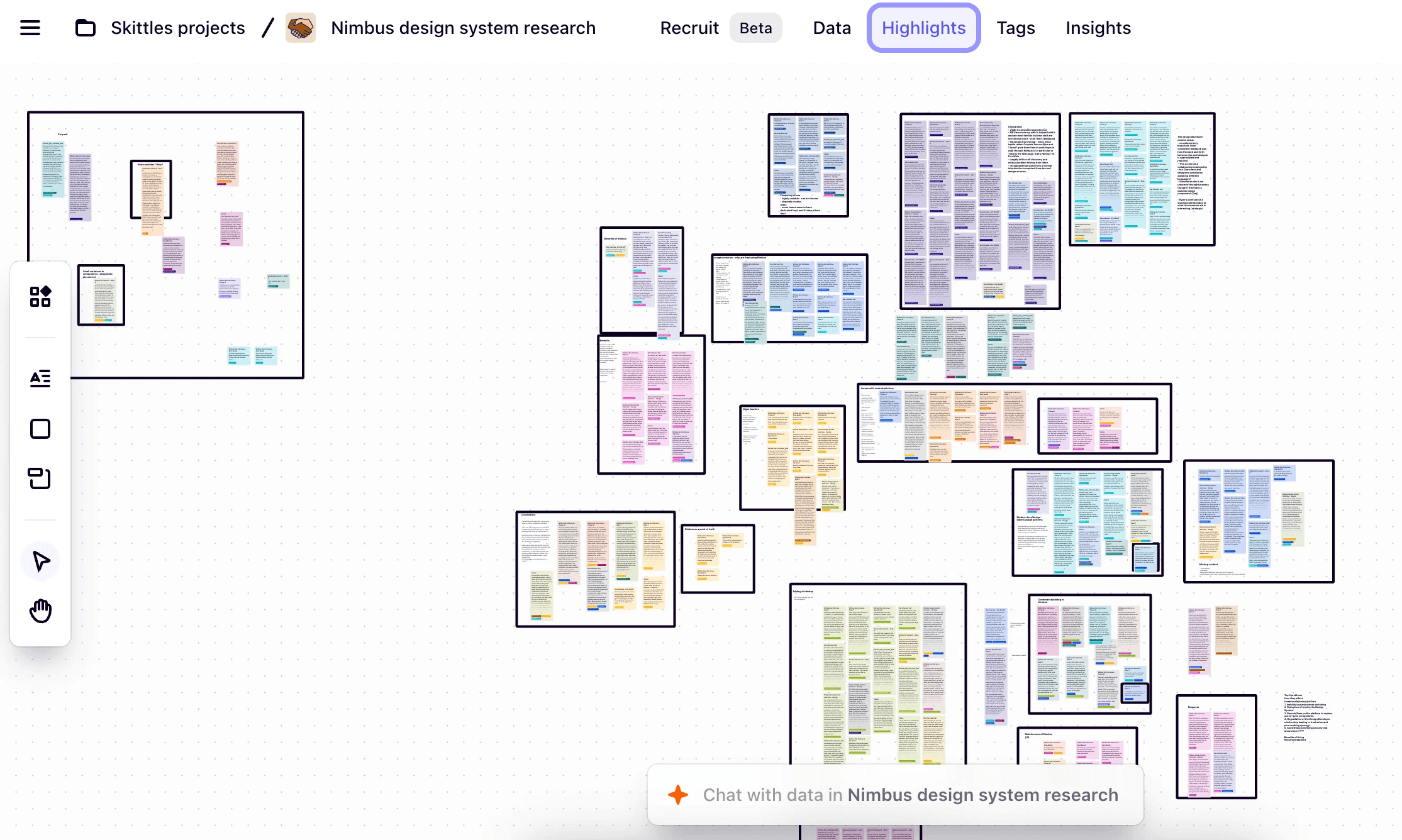
Identified six core problem areas
The findings consistently grouped into six core categories, giving us a shared language for discussing issues across design and engineering.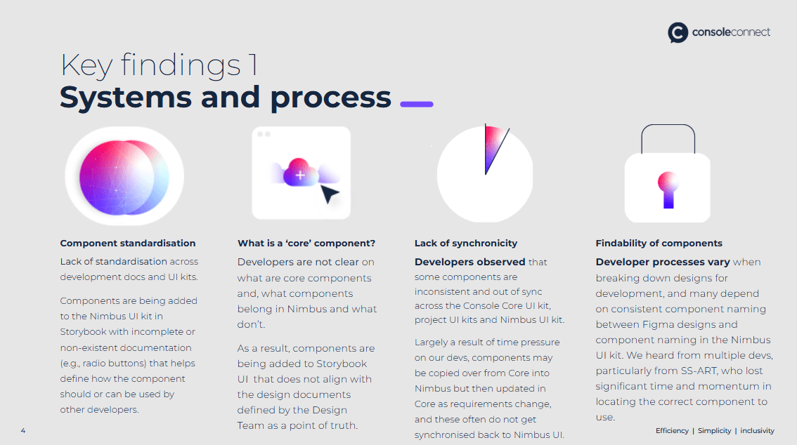
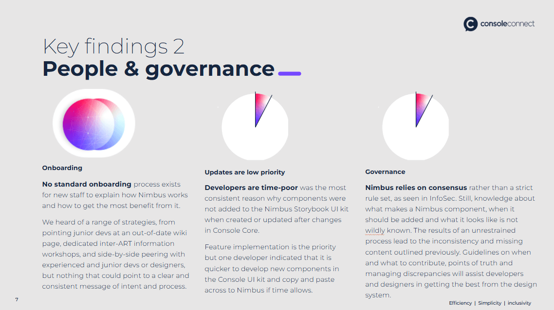
Validated findings against the system itself
While the research highlighted where users were struggling, it didn’t fully explain why. To close that gap, I ran a detailed analysis across what was documented, designed, and built.Translated misalignment into a delivery roadmap
The gaps and inconsistencies we uncovered became the blueprint for reimagining Nimbus by directly informing what we rebuilt, what we removed, and what needed clearer ownership.🔗 Nimbus Design System: User Research
👆 Have a look at our design ppt we presented to stakeholders
2. Solution
With a clear understanding of the problems, I focused on rebuilding Nimbus from the ground up.
Established a trusted core component set
Defined a small, reliable foundation of components teams could confidently build on. Rather than patching legacy patterns, we rebuilt the foundations to prioritise consistency, accessibility, and long-term scalability.Designed an accessible colour system
Created a colour palette from first principles, with accessibility built in. This included semantic colour roles, validated contrast ratios, and a structure that scaled across products without fragmenting.Embedded accessibility with react-aria
Introducedreact-ariaas a core dependency for all interactive components, ensuring robust, standards-compliant accessibility while maintaining full control over visual design.Standardised documentation with Storybook
Committed fully to Storybook as the primary documentation platform. Live, coded examples proved to be the most effective way for developers to adopt components quickly and correctly.Rebuilt design and code libraries in parallel
Reconstructed both the Figma and code libraries from scratch. I led and executed both the design and development, ensuring tight alignment and eliminating design-to-code drift.
👆 Have a look at the core components in our nimbus storybook. I've designed, built and documented each one meticulously.

Results and Impact
Faster, more predictable delivery
Teams spent less time rebuilding foundational UI
Fewer late-stage UI changes during delivery
Reduced reliance on bespoke components
Improved consistency and accessibility
Clearer reuse of shared components across teams
Accessibility concerns surfaced earlier or were avoided entirely
Fewer inconsistencies between design and implementation
Stronger developer confidence
Developers reported higher trust in Nimbus components measured through surveys (qualitative research)
Reduced need for clarification or custom work
Increased willingness to adopt Nimbus for new features
Reflection
Nimbus was not a clean or easy project. It was messy, political, and slowed by systemic issues. Engineering momentum was hard to build, and designers often had to continue working in the old system before the new one was fully available.
While it’s tempting to present a polished narrative, that wouldn’t be honest. Change at this scale involved constant resistance, red tape, and moments where progress felt blocked at every turn.
If I were to approach a design system overhaul again, I would invest earlier in advocacy and collaboration—bringing engineering teams into defining standards rather than setting them unilaterally. I’ve learned that w hen people aren’t taken along for the journey, even the best systems struggle to gain trust.