Early contributions to Outfit’s design system
TLDR;
Core challenge
Outkit, Outfit's design system, was built almost entirely from Chakra UI primitives. Everyday UI situations like long labels, complex drawers, toggle choices and in-page navigation had no shared answer, so the same problem was often solved differently across the product.
Solution
As a junior designer, I added four reusable pieces to Outkit: automatic truncation with tooltip, Drawer templates in Figma, a toggle button group, and an on-page tabular navigation pattern. Each one turned a repeated, one-off decision into something the whole team could reuse.
Impact
A more complete system
Filled gaps between Outkit's primitives and the patterns teams actually needed, so more of the product could be built from the system instead of one-off solutions.
Consistent by default
Truncated labels got a tooltip automatically, taking a small but repeated decision off every screen with long text.
Shared patterns, not reinvention
Drawer templates and on-page tabular navigation gave the team one agreed way to build panels and switch between related views.
As a junior designer
Outkit was such a great project
A collection of hands-on contributions from my time as a junior designer, alongside what I’d approach differently today. Four small additions that became part of the system others built on, with some background on my role at Outfit and how I contributed to its evolving design system.
Truncated Tooltip
This is a super long label spanning three lines
Drawer Templates
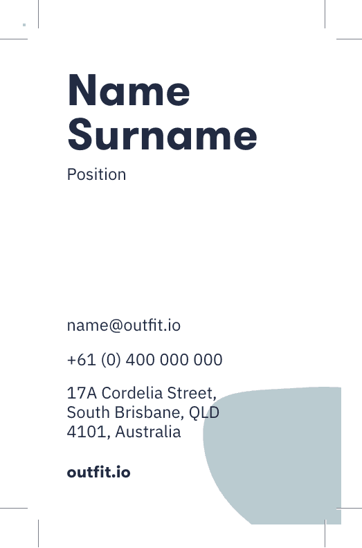
(AU) Business Card Print
JL
James Lee
Team Name
23 Jun 2020, at 4:30 pm
TD
AL
EC

WW
Changes
Activity
Toggle Button
1
2
3
4
5
6
7
8
9
10
11
12
13
14
15
16
17
18
19
20
21
22
23
24
25
26
27
28
29
30
31

On page navigation
Four small additions, each one a piece of the system other people built on.
Notable contributions